Lake Forest Kitchen Transformation
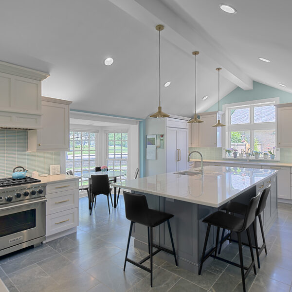
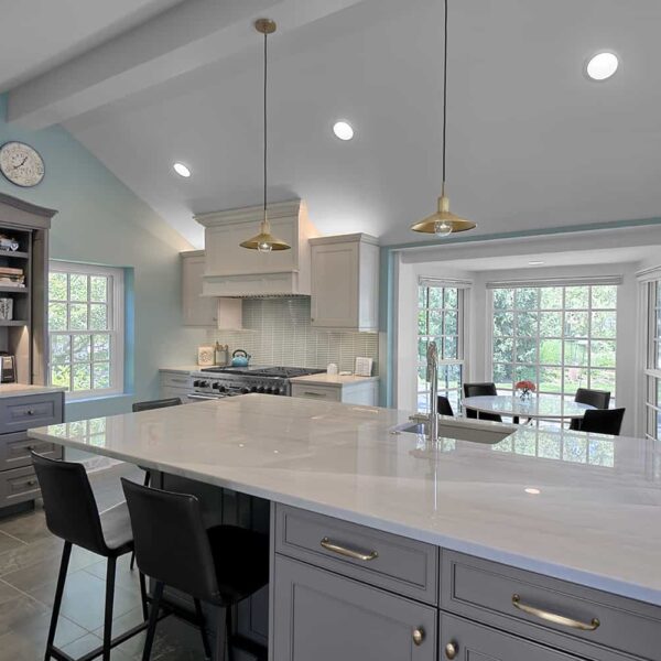
While planning to redesign her kitchen herself, Stacey hit a wall. She had already ordered appliances but got stuck on where to place things. She reached out to the Pickell team for help. “They drew up a floor plan and I was in shock—I never would have thought of it,” offers Stacey. “Everything had been clustered near a window.” Instead, moving the range, enlarging a window, shifting the island and completely rethinking the flow makes the space feel entirely new.
After five years in their Lake Forest home, Stacey and David were eager to get to work on the kitchen. “When we moved in, most of the house was yellow,” recalls Stacey. “The kitchen had yellow cabinets and travertine tiles—we wanted it to be more ‘us.'” Over the past few years, they had updated the home in shades of blue and were ready to gut the kitchen and start fresh.
The palette grew out of a KitKat style, aqua tile Stacey fell in love with while shopping for flooring. “No matter what,” she thought, “We’re working around that.”
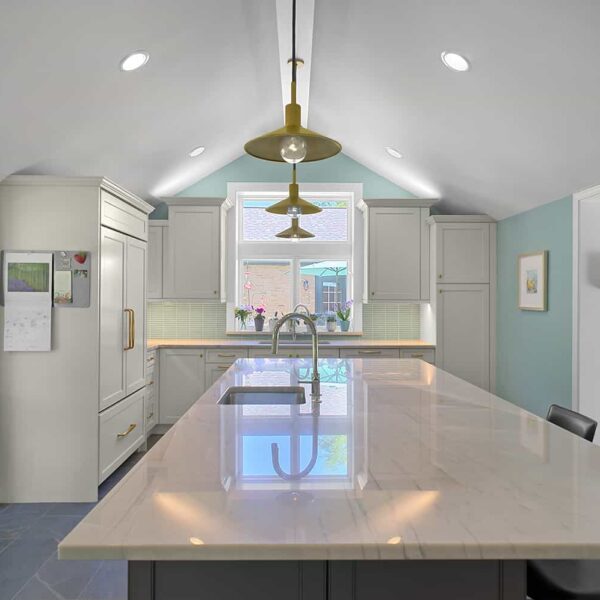
The backsplash tile sets the tone for a breezy aesthetic that visitors describe as “refreshing.” White painted cabinetry and millwork continue across the refrigerator and range hood, making the space feel calm and uncluttered. Gray cabinetry complements the look, including a bakers cabinet that feels right at home in the English cottage-inspired house. Off-white quartzite with gray streaks extends across all of the surfaces—perfect for a homeowner who loves to bake. Gray porcelain soapstone tile, inspired by a floor the couple had in a previous home, feels warm and inviting underfoot.
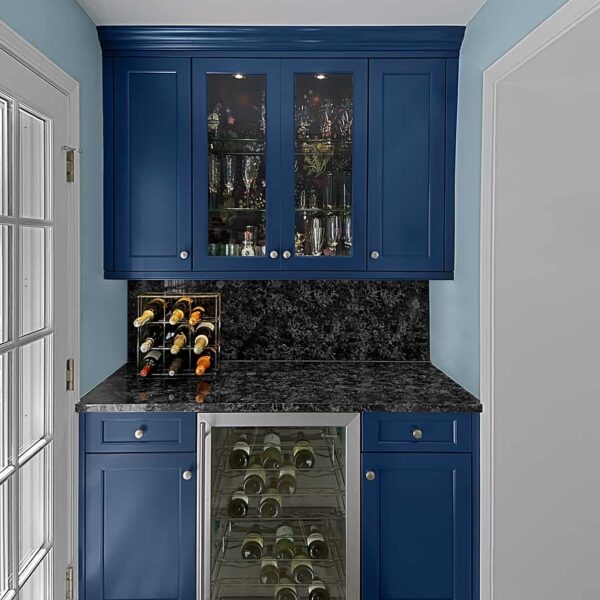
In addition, an adjacent dry bar received an attention-grabbing upgrade, featuring bold, Prussian blue cabinets lined with dramatic botanical wallpaper Stacey found on Etsy.
“My husband may have found it annoying, but I’m very meticulous,” notes Stacey. “If I’m going to spend the money, I have to love it.” So Stacey spent a long time deciding on cabinets, faucets and more, ultimately opting for nickel sink fixtures in lieu of the light gold tone used on drawer pulls and the pendants above the island—and it works beautifully. “I’m very happy with how everything came out.”


